
Almay
Almay has long been a trailblazer in the beauty industry, becoming the first brand to use hypoallergenic ingredients, create fragrance-free products, and rigorously test for allergies and irritation. These pioneering efforts have been the heartbeat and core ethos of the brand since its inception in 1933. However, fast forward nearly 100 years, and Almay found itself at a crossroads. The brand had been subjected to multiple rebrands and new logos, which, over time, led to a lack of consistency and clarity in its packaging architecture and overall brand identity.
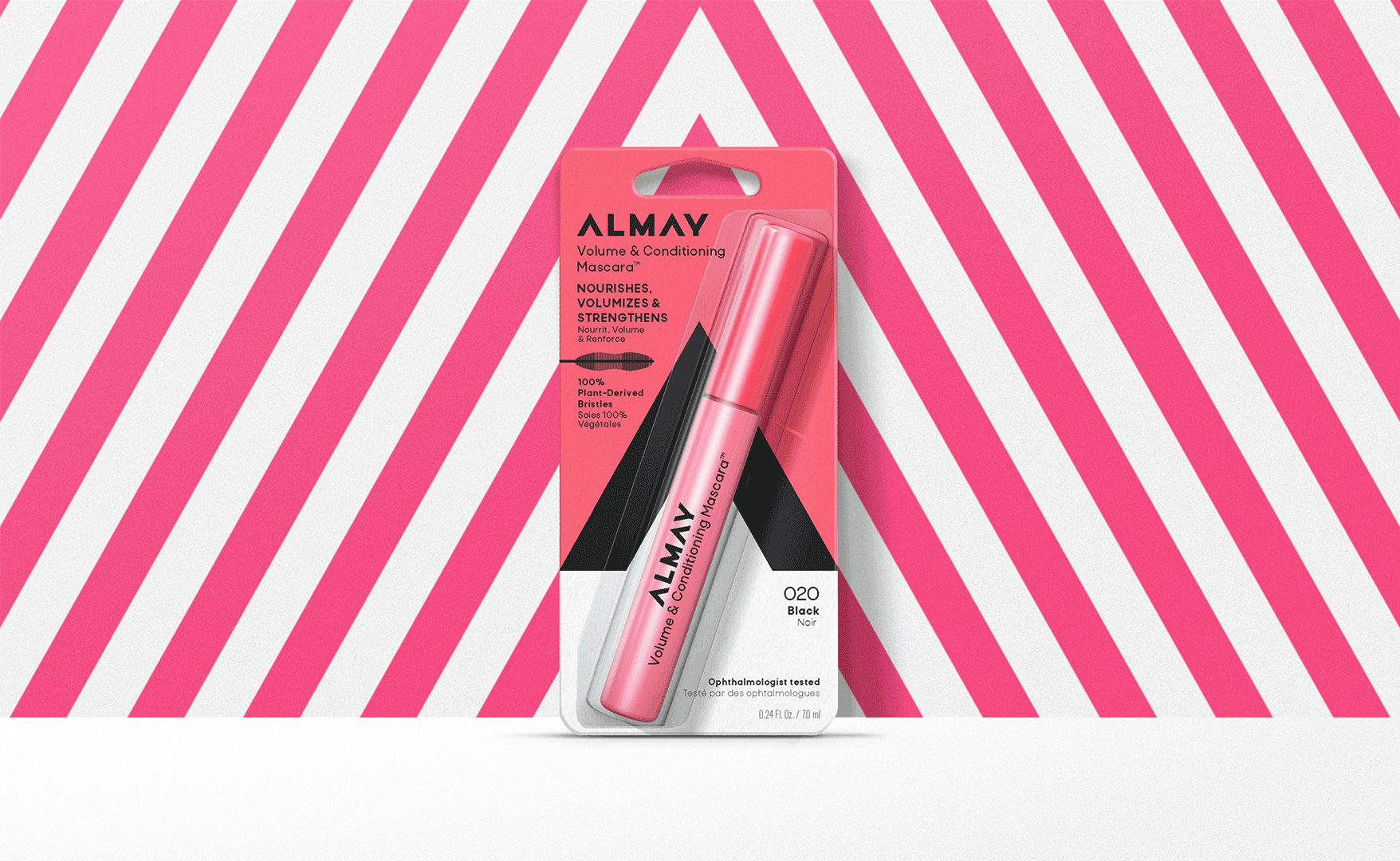
In response, we sought to simplify and strengthen the brand’s visual identity by focusing on its most recognizable asset—the arrow. By reimagining this iconic symbol, we developed a distinct and unmistakable brand pattern that not only stands out on the shelf but also serves as a powerful representation of the company’s ongoing commitment to progress and innovation within the beauty category.
The new design approach provides Almay with a unified and cohesive visual identity that clearly communicates its heritage, while simultaneously reinforcing its forward-thinking philosophy. The arrow now serves as both a brand mark and a visual cue, symbolizing Almay’s dedication to continuous improvement, as well as its focus on delivering products that meet the evolving needs of consumers in the skincare and cosmetics space.
Creative Director - David Thompson
Design Director - Brinley Clark & David Blakemore
Designer - Rosie Helier
 |  |  |  |  |
|---|---|---|---|---|
 |  |  |  |  |
 |  |  |  |  |